IONICWEBCREATOR
Case Studies
LiveDreamDesk

DreamDesk – Career Counselling & Education Website

A custom-built education and career counselling website designed to connect students with expert guidance, career opportunities, admissions support, and consultation services through a clear and conversion-focused digital experience.

  • Education & Career Guidance
  • 2025
  • 3 min read
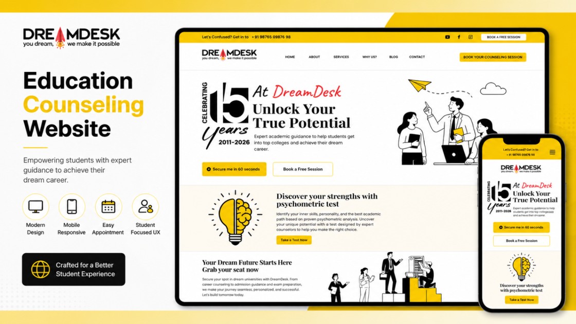
DreamDesk education counseling website case study preview showcasing a modern responsive web design across desktop and mobile with student-focused UX and appointment booking features.
Overview

Project overview

DreamDesk wanted a modern digital experience that could clearly present its education and career counselling services while making it easy for students and other audiences to discover relevant programs, understand available guidance, and get in touch with the team. We designed and developed a responsive custom website focused on clear navigation, strong calls to action, service discovery, and lead generation. The website was built from the ground up using HTML, CSS, JavaScript, and AJAX, with interactive sections and enquiry flows designed around the needs of students, colleges, and companies.

Client
DreamDesk
Industry
Education & Career Guidance
Category
Web Applications
Role
UI/UX Design & Custom Web Development
Year
2025
The challenge

The business challenge

DreamDesk needed a website that could clearly communicate its wide range of education and career counselling services without overwhelming visitors. The challenge was to organize complex information for different audiences while keeping the experience simple, responsive, and focused on generating consultation enquiries.

Discovery

Discovery & strategy

Where we started before writing code — framing the problem, the constraints, and the plan.

  1. Mapped the daily loop

    We shadowed how teams move between tasks, notes, and calendar in a day, and designed the surface around that loop rather than a feature list.

  2. Planning the Website Experience

    We reviewed DreamDesk's counselling services, student journey, and key audience groups to structure the website around clear service discovery and easy access to relevant information.

  3. Custom UI & Frontend Development

    We translated the approved experience into a responsive custom interface using HTML, CSS, JavaScript, and AJAX, with interactive sections designed for smooth navigation and engagement.

  4. Testing & Optimization

    We tested the website across screen sizes and refined interactions, layouts, forms, and performance to deliver a consistent experience across desktop and mobile devices.

Architecture

System architecture

A custom frontend architecture built for speed, responsiveness, and straightforward content delivery. The website combines structured HTML and CSS with JavaScript and AJAX-powered interactions to create a smooth experience across desktop and mobile devices.

  • Frontend

    A responsive, user-focused interface built with semantic HTML and custom CSS, designed to present DreamDesk's services, resources, and calls to action clearly across screen sizes.

    • HTML5
    • CSS3
    • Responsive Web Design
  • Interactive Experience

    JavaScript and AJAX power dynamic interactions, enquiry flows, content updates, and other interactive elements without requiring unnecessary full-page reloads.

    • JavaScript
    • AJAX
    • DOM Manipulation
  • Content & Lead Flows

    Structured service content, consultation journeys, enquiry forms, and conversion-focused calls to action help visitors quickly find relevant information and connect with DreamDesk.

    • HTML Forms
    • AJAX Requests
    • Client-side Validation
Decisions

Design decisions

The trade-offs worth explaining — what we chose, and why it was the right call for this build.

  • Responsive-first interface

    The website was designed to work consistently across desktop, tablet, and mobile screens, ensuring students and other visitors can access services and enquiry options comfortably from any device.

  • Clear service-based navigation

    The content structure was organized around DreamDesk's key services and audience needs, making it easier for visitors to understand the available guidance and quickly reach the relevant information or consultation action.

  • Interaction without unnecessary page reloads

    JavaScript and AJAX were used where appropriate to create smoother interactive experiences and dynamic content updates while keeping the overall website lightweight and responsive.

  • Conversion-focused calls to action

    Important actions such as booking a consultation, requesting guidance, and contacting DreamDesk were given clear visual priority so visitors always have an obvious next step.

Stack

Technology stack

Every layer of the system, and the tools chosen to build it.

Frontend
  • HTML5
  • CSS3
  • JavaScript
  • AJAX
Backend
  • PHP
Database
  • MySQL
Features

Key features

The parts of the build that carried the most product weight.

  • Clear Service Discovery

    Organized service sections make it easy for students and visitors to explore counselling, career guidance, admissions, and related services.

  • Consultation & Lead Generation

    Prominent consultation and enquiry actions help visitors quickly connect with DreamDesk and take the next step toward expert guidance.

  • Responsive Custom Experience

    A custom-built responsive interface delivers a consistent and accessible experience across desktop, tablet, and mobile devices.

Results

The outcome

DreamDesk now has a modern, responsive digital presence that clearly communicates its education and career counselling services, guides visitors toward relevant information, and makes it easier for prospective students and clients to connect with the team.

Retrospective

Lessons learned

What the engagement taught us, kept honest rather than tidy.

  1. Clarity Drives Engagement

    Clear service structure and straightforward navigation make it easier for visitors to understand their options and take the next step.

  2. Design for Every Screen

    A responsive-first approach is essential when students and visitors access education and counselling information across phones, tablets, and desktops.

  3. Make the Next Step Obvious

    Strong, well-placed calls to action help turn website visits into meaningful enquiries and consultation opportunities.

Related

Other work with a similar shape — by industry, stack, or the problem it solves.

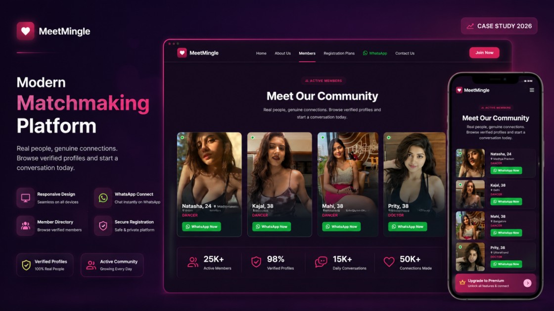
  • MeetMingle matchmaking platform case study preview showcasing a responsive website with verified member profiles, WhatsApp integration, membership features, and a modern dark-themed UI across desktop and mobile.
    MMeetMingle
    Live

    MeetMingle

    Social & Community

    MeetMingle is a custom WordPress matchmaking platform created to make finding compatible profiles simple and engaging. We developed a responsive, conversion-focused experience featuring member profiles, membership plans, WhatsApp integration, and an easy-to-manage admin panel that supports ongoing content and user management.

    • WordPress
    • PHP
    • MySQL
    • HTML5
    • CSS3
    • JavaScript
    • jQuery
    • AJAX
    • Bootstrap
    • cPanel
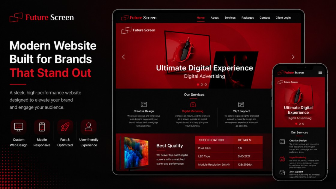
  • Future Screen modern business website case study preview showcasing a responsive corporate website design across desktop and mobile with a bold red and black user interface.
    FSFuture Screen
    Live

    Future Screen

    Digital Media

    A responsive business website built for Future Screen to showcase premium LED display advertising services in Siliguri. The platform highlights advertising opportunities, pricing, screen specifications, and campaign benefits while providing businesses with a simple way to inquire and launch digital advertising campaigns.

    • HTML5
    • CSS3
    • AJAX
    • PHP
    • MySQL
    • phpMyAdmin
    • Apache
    • cPanel
    • Git
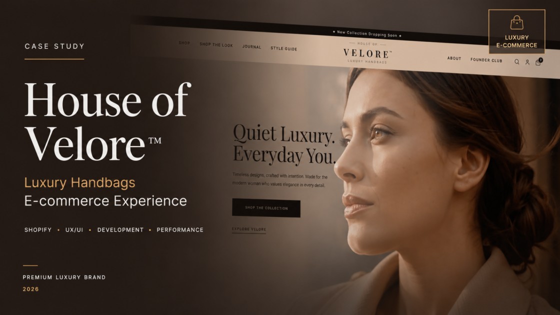
  • House of Velore luxury e-commerce website case study cover.
    HOHouse of Velore
    Live

    House of Velore

    Fashion & Retail

    A luxury fashion storefront built for a considered browse and a frictionless checkout — fast on every device and structured so the catalogue scales with the collection.

    • Next.js
    • React
    • TypeScript
    • PostgreSQL

Have a problem worth solving well?

If the thinking above matches the standard you're after, tell us what you're building. We'll be honest about fit and outline a concrete first step.